BRANDguide
Bootstrap 5 theme for your Brand Guidelines documentation.
Brand Style Guide
Brand Usage Terms and Conditions
Your first step should be to define and include a description of the scope for the usage of your brand guidelines document both internally and externally. We have provided an example below of some boilerplate text to cover most common scenarios.
ABC Kennels Limited (“the company”) owns the the company kennel trademark, logos and designs ("the designs") that it frequently uses to identify and promote the the company brand. The brand standards defined herein are approved by the company. Unless you have a separate written agreement with the company, that specifies alternative use of the designs, all use is subject to this guide.
The company hereby grants non-transferable, non-exclusive, royalty-free limited licence to use the designs as detailed in this guide. Your use of the designs, including any licence which may have otherwise been agreed to in writing, does not grant you any ownership rights to the designs, including, but not limited to, any logos, designs, or other similar materials. The company retains all rights and title to as well as interest in the designs materials, including any intellectual property rights therein. Any use of the the designs must be accompanied by a notice that clearly indicates that the designs are trademarks of the company.
You will not display the designs in any manner that implies that you are related to, associated or affiliated with, or sponsored or endorsed by the company or in any manner that could reasonably be interpreted to suggest that your content represents the company views or opinions or suggest that the company has authored, approved, or edited your content, website, product, or service.
Colour Guide
Colours are crucial to the recognition of a brand. Therefore it is essential for everyone who implements your brand online or in print to use your official colors.
This includes your primary and secondary brand colours from you colour palette, and the colours against which your colour scheme can be used. Reproduce the colour, along with the RGB, HEX, CMYK, and PMS codes, and be clear about your primary, secondary, accent, and background colors.
Primary Brand Colours
Colour should be used to evoke the emotion or experience with which your brand wants to be associated e.g sailing and blue for the sea etc. Choose two or three colours and shades to represent your brand.
Secondary Colour Palette
In many cases you may need more than two or three colours to create marketing material depending on the scope of your marketing activity. Create a secondary colour palette with a range of complementary colours to provide additional flexibility while maintaining brand consistency.
Primary blue title
- Hex: #000000
- RGB: 10/13/13
- CMYK:
- Pantone:
Secondary grey title
- Hex:
- RGB:
- CMYK:
- Pantone:
Primary green title
- Hex:
- RGB:
- CMYK:
- Pantone:
Secondary Red title
- Hex:
- RGB:
- CMYK:
- Pantone:
Incorrect Usage
Using the primary secondary logos defined in your logo document. Provide examples of incorrect usage of the logo to avoid brand confusion and maintain a consistent look and feel across all platforms. Typical examples of misuse of logos and icons are as follows. This may seem very obvious but in many cases you will be supplying the file to a third party in an editable format such as Adobe photo shop or illustrator. In these cases the third party can edit the logo when incorporating into their printed or digital publications. Giving examples of incorrect usage will prevent your brand being misrepresented.
Adding a background making name unreadable.

Changing Colours
Change Orientation

Change Scale

Logo and Icons
In this section define a number of logo types. For example transparent logo, logo with background, small icon style without a title and options for vertical and horizontal layout. This will depend on the usage of the logo for example online only or online and print and whether third parties will be using the logo.
Primary Logo
Provide your logo in a variety of sizes and file formats for download and show how it works in a variety of situations – the less you leave to chance, the better for your brand. You’ll need different formats for print and digital, and also for designers, developers, and external partners, as well as internal users. In this example the logo includes the company name and the primary version is rectangular. The clearance marks are 10% of the logo size.

Secondary Marks and Symbols
Define the primary and secondary use of the logo. For example horizontal layout is the primary use with a vertical version as the secondary if there are constraints to the size and spacing when using the logo.
Size and Spacing
By providing primary and secondary options users of the logo will be able to pick an option which meets your brand requirements for size and spacing and their requirements when incorporating your brand.
Trade Mark Usage
Where your company owns a trademark or a copyright notice establish your brand standards in relation to the use of the trademark in third-party publications. Whereas the logo usage sets out the visual standard. The trademark standard describes the use of the trademark in conjunction with third-party copy to avoid confusion between your brand and that of the publisher.
- Always use proper trademark form and spelling For example "ABC boarding kennels" not ABC kennels.
- Use the trademark with the correct font formatting, ie initial letters capitalized or all letters capitalized, italics, or quotation marks. For example ABC is in capitals and boarding kennels lowercase.
- Where applicable use the trademark as an adjective, not a noun or a verb. For example "ABC is the largest boarding kennels in Essex" and not "ABC boarding kennels in Essex"
- Always include an attribution of your ownership of your trademarks within your product documentation and communication. Similarly insist upon an attribution if if the trademark is included in third-party publications.
Incorrect trade mark examples
- Be consistent. Do not modify a trademark to a plural form. For example ABC's Kennels
- Do not translate a trademark into a foreign language.
- Do not alter a trademark in any way, including through visual identifiers or unapproved fonts. See incorrect usage.
- In third-party publications which include an attribution ensure that other third-party are not similar leading to mis-representation.
- Do not abbreviate a trademark as an acronym except unless authorised.
- Do not allow usage of a trademark in relation to products or services where communication may be explicit, vulgar, offensive or illegal.
Typography
Typography helps distinguish your brand from the crowd, it is a key factor in describing your brand identity instantly attracting attention and building recognition. Like grammar typography is a somewhat strange artistic form however there is no doubt that when used correctly it can create a sense of occasion, be used the structuring information and helps understanding through readability.
The typefaces that represent your brand should be easy to read and flexible enough to cover all communication requirements across all platforms.
Primary Font
The primary font should be available on all platforms. Therefore if you have a legacy font to which your brand is associated and was traditionally used in print you may need to define an additional primary from digital.
Some fonts work well in print but don’t look great on screen and vice-versa. If your brand exists mostly online, make sure you select fonts that are optimised for digital. Similarly, if you’re planning on translating your website into different languages, make sure your font comes in all the alphabets and with the character features you require.
Where possible avoid custom fonts as these can be difficult to make available on digital platforms by a web server which may not be able to render the font correctly. Choose primary fonts to suit different uses, platforms, and occasions. Nominate the different sizes and weights you’d like to see used to represent your brand. If your brand is associated with a custom font make sure this is available in a format suitable for Web servers and also available for download by printers and publishers. In our logo example we are using Georgia font.
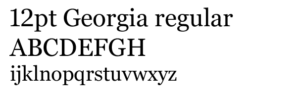
Secondary Font
Secondary fonts are worth defining for additional flexibility for example if your brand is available in different languages where a different font would be more suitable for accent characters to improve readability. Whereas the web font used by this site is defined in the CSS files as Open Sans
Font Scaling
Defining the relative scaling of fonts is important particularly if your brand is used across different platforms i.e. display advertising which includes a byline or slogan together with the logo. Defining the relative font sizes is essential for third-party publishers to maintain the consistency of the brand across all marketing campaigns.

In our logo example the relationship between "ABC" which is the name of the company and the description "boarding and kennels" is 220/50.
Web and Print Typography Principles
When you are representing your band on different platforms provide guidance around how your typefaces should be presented: for example, leading and spacing, whether you centre or justify copy, and the font color. An important consideration is usage on digital for desktop and mobile versus print. Print traditionally has a smaller font size than either desktop or mobile and due to high-resolution screens mobile font sizes have increased. In print, the optimal point size for body text is 10–12 point. On the web, the optimal size is 15–25 pixels.
Web heading example 18pt with 1.2 line height
This paragraph is 14pt with line height of 1.5
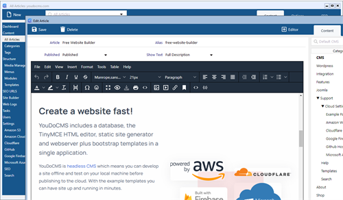
Create more than documentation with YouDoCMS
YouDoCMS includes 6 pre-defined websites and can work with any HTML template.
A Static CMS for Mac and Windows to manage content, generate static pages and much more. Load pages faster and improve your search ranking. Integrated with the Schema.org database to ensure your pages have the correct classification. Generate Google structured data in the preferred JSON LD format to incorporate in the header tag of your static pages.
Learn SEO